Using the brand digitally
Supporting your message with presentations
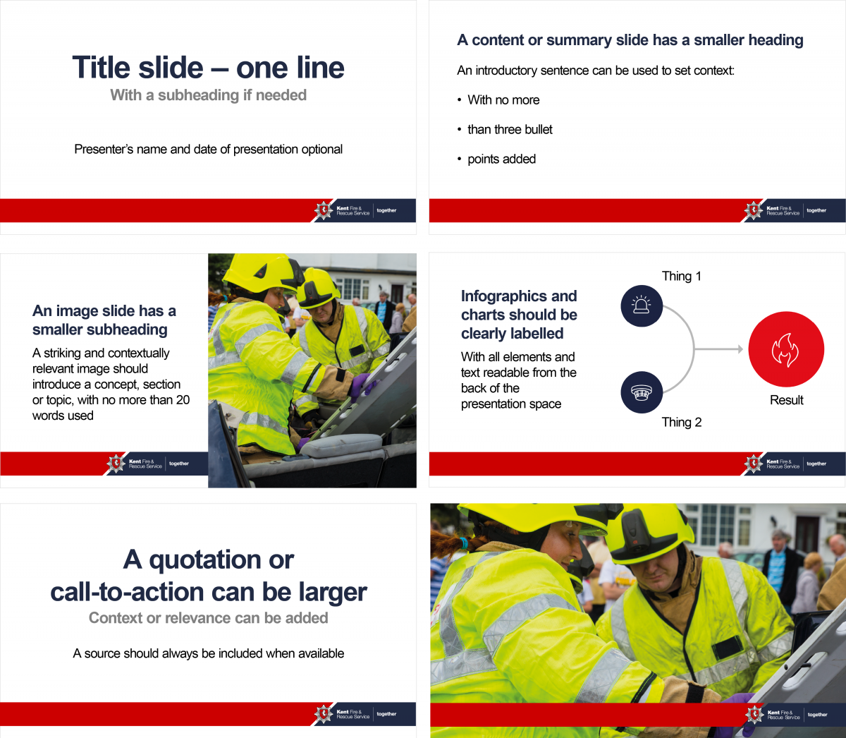
As with all marketing materials, use the information in this brand guide to help bring your content to life. Think carefully about the use of colour, typography, imagery and tone of voice. New templates will be provided to assist with this.
The most important thing to remember is that a PowerPoint slideshow or other slide deck should not be the entire content of your presentation
We’ve put together some key tips to follow below:
Keep your slides simple
Space is your friend, so leave plenty of room. The less cluttered your slides feel, the more powerful your message will be.
Limit the number of slides
If you cannot get your message across in fewer than ten slides, then a slide deck may not be the right choice for this task.
Grab your audience’s attention
Use a single, striking image, a key word, phrase or quotation or very short statements and questions as a visual reminder of the current topic, that you can then talk about.
Limit bullet points and text
If you must use bullet points, keep to a maximum of three with one short, sharp sentence to support. Use too much text and your slide deck will start to feel like presenters’ notes rather than a visually engaging presentation. The audience will be reading not listening, especially if you give handouts with the presentation included.
Limit transitions and animations
Used sparingly these effects have impact and give presentations a professional feel. Overuse does nothing but distract from your message.
Use high-quality graphics
This is also true of photography. Avoid pixelated, stretched images and clip art. If you can’t find the right image or graphic, contact the Engagement team.
Typography
Use the same font throughout, this should be Arial.
Arial Normal for the body text and Arial Bold for Headings. See the typography section for further information.
Make sure everything works
There’s nothing worse than watching a presentation fall apart due to technology failures, so make sure any video or other media is embedded and doesn’t rely on an internet connection which can fail.
Practice makes perfect
People who make presentations professionally will rehearse many times before the main event, they will often rehearse for ten minutes for every minute of their presentation. Seek inspiration from TED Talks and similar sources for great examples of presentation skills.
Consider accessibility
If you have to ask “can everyone see this?” then you’re potentially excluding people and need to consider presenting the information in a different way. Try reviewing your slide deck from the back of the room (at a distance your audience will see it) and make changes if necessary.
New PowerPoint presentation templates will be available via the intranet in November 2020

