Two versions of the logo exist, each with a different purpose:
- The large version was created for larger format applications, such as signage and vehicle livery.
- The small version was created for items such as stationery and printed marketing materials. It has been formatted to print perfectly when reproduced.
All staff needing access to the Kent Fire and Rescue Service logo should speak to the Engagement team first.

- The large version logo should be used if the height requirement is 48mm or above.
- Signage
- Vehicle livery

- The small version logo should be used if the height requirement is 47mm or below.
- Stationery
- Printed marketing material

-
The badge will only be used:
• in isolation on PPE helmets
• as the profile image on social media
Greyscale and black and white logos
There will be times when it is not possible to print in colour. In those circumstances the type of logo you use will depend on the type of finish you need.
The greyscale logo is the one to go for when high print quality is required. If the quality of reproduction is not so important – or what is being printed is of a smaller scale – then the black and white version is the one to use.
If you need the Kent Fire and Rescue Service logo to be used very small use the black and white version not the greyscale one.
- High quality print.
- The large version logo should be used if the width requirement is 48mm or above.
- Press adverts.
- In-house documents.
- The small version logo should be used if the width requirement is 47mm or below.
Exclusion zone
The exclusion zone relates to the minimum unobstructed area or space that surrounds the logo.
When using the logo keep that space around it free of type, rules or any other graphic device. Having an acceptable colour in the background is the one exception, as specified in the backgrounds section below.
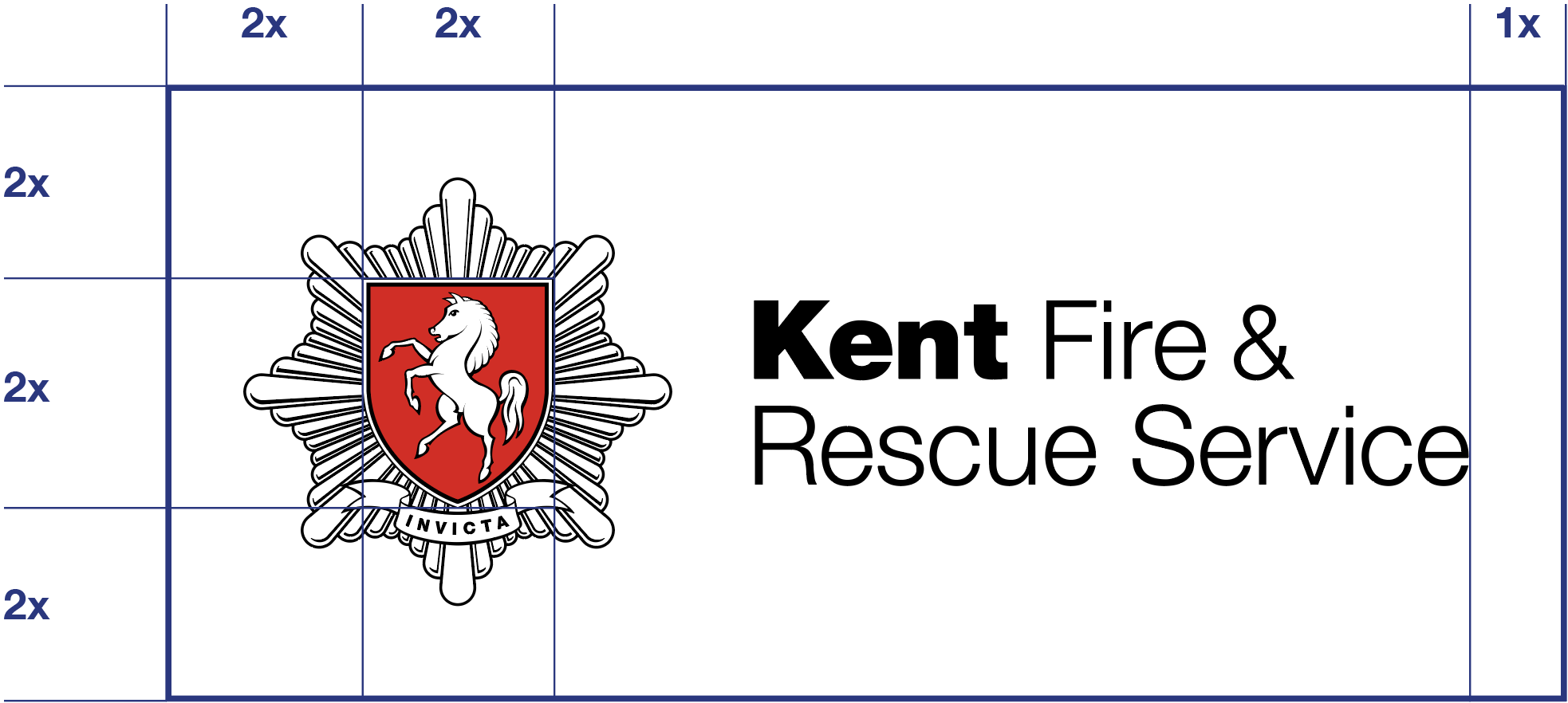
- Example shows minimum area (as shown by thick keyline) on large version logo. The same principle works for the small version.
Minimum size
We have some rules to ensure the logo has the clarity and reproduction quality you need.
- Use the logo without the strapline for very small reproduction, and only the black and white version. See the 12mm example on this page.
- The large version logo should be used if the size requirement is 48mm or above. The small version (16mm) should be used if that requirement is 47mm or below.
Backgrounds
When using our logo consider how the version you have looks in context with the rest of the photograph. The same is true if you have the logo set against a colour graphic background.
We have simple rules to follow:
- For backgrounds make sure it’s an approved corporate colour as in the examples shown on this page.
- Use an image that will hold the detail so the text or logo can be clearly seen against the background.
- If it doesn’t look right, remember that text for Kent Fire and Rescue Service can be black or reversed (known as white-out). Which one you choose will depend on the quality and contrast of the background, as shown in the example.
-
Good to know
Make sure the correct version of the logo is used (small or large).
How not to use the logo
We’ve put together some examples of how not to use the logo below. This is to make sure we keep things consistent.
If you come up against a problem, it may be that you need a different size or type of logo or a better image.
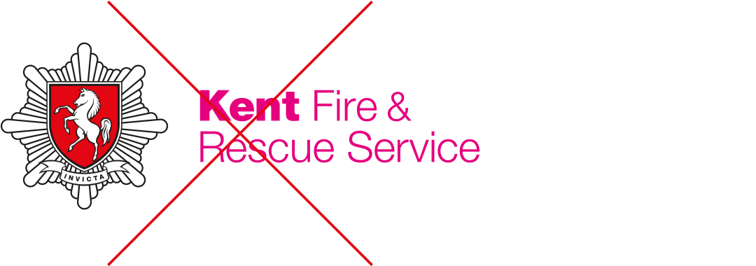
- Don't change the colour of the text or other logo parts
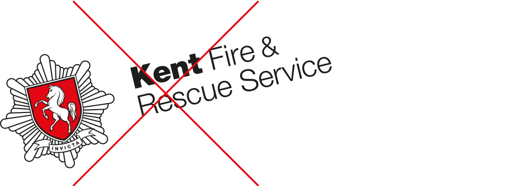
- The logo should never appear rotated
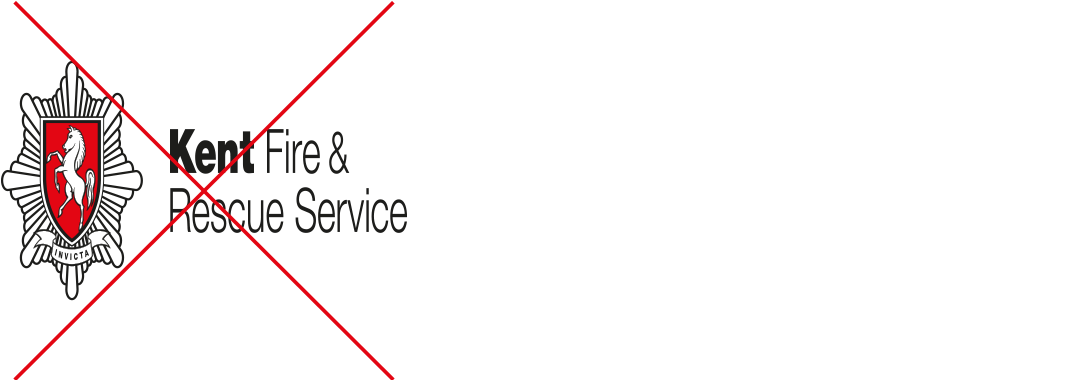
- Don't stretch or squash the logo by resizing the image
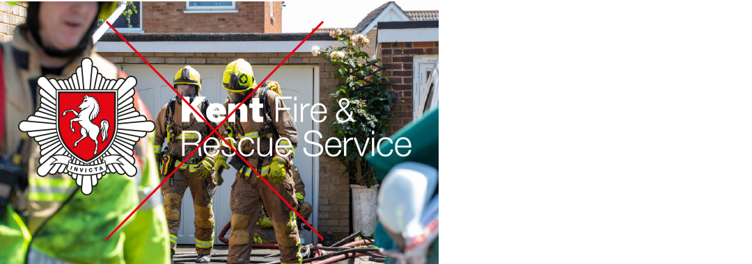
- Only use logo on top of photos if it's clear and impactful with good contrast
