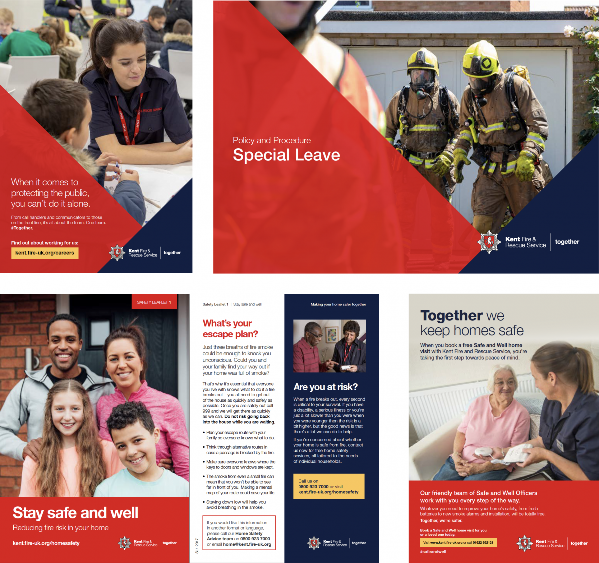
Where to position our logo and strapline
The logo should only appear once. The preferred position is in the top left or bottom right corner. Take care to ensure there is enough space around the logo. The strapline ‘together’ should be positioned to the right of the logo. If this is not possible the strapline can be used in the header or sign off content.

Our graphic style
Where possible, we want to be bold in our use of graphic style, as it provides both impact and recognition across our communications.
By following the style in this guide – from colour and typography to imagery – we can ensure Kent Fire and Rescue Service stands out from the crowd. We can also do this by making use of what we call our graphical element.
This device takes its lead from the eight points of our logo.


