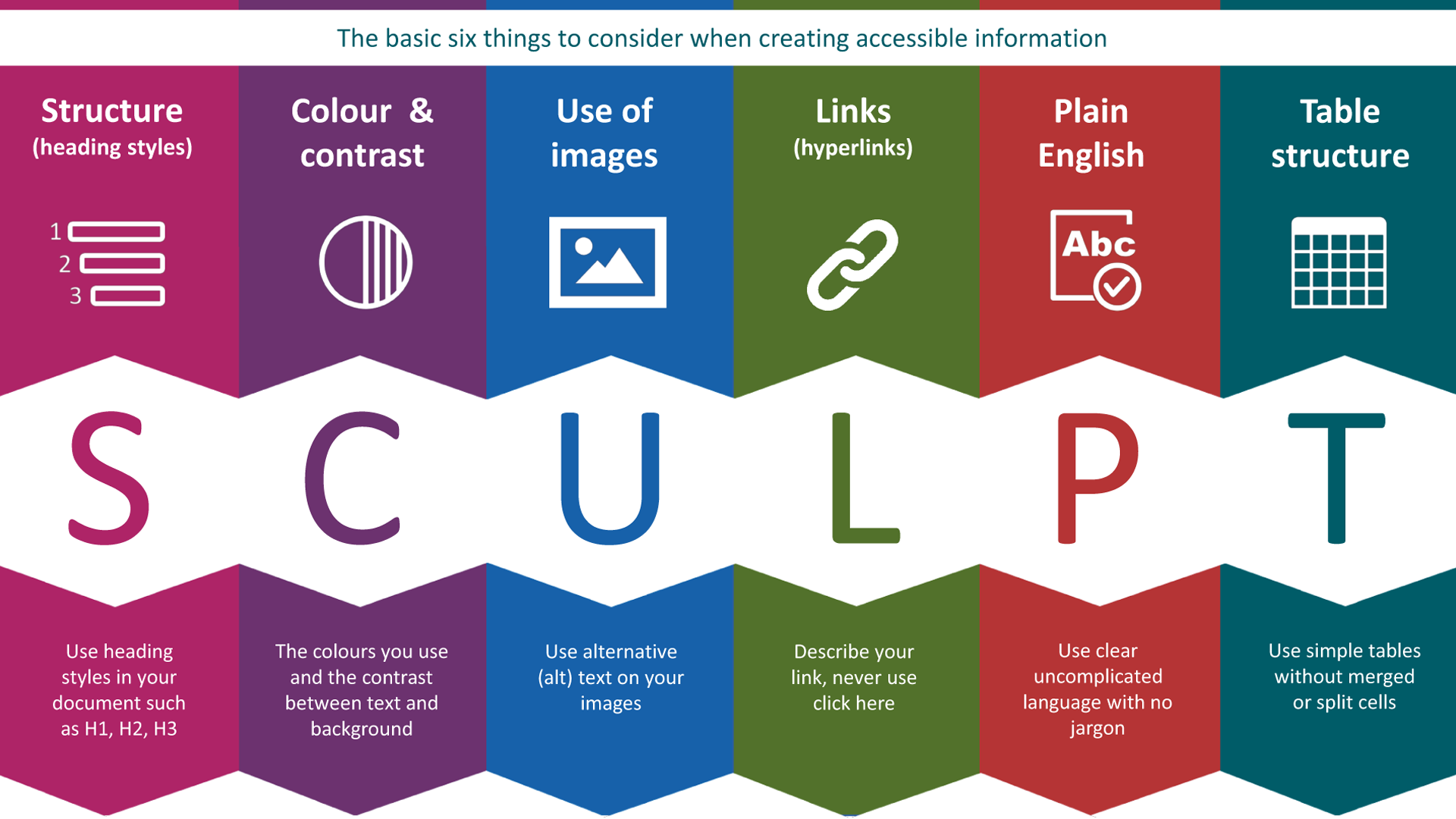
Structure (heading styles)
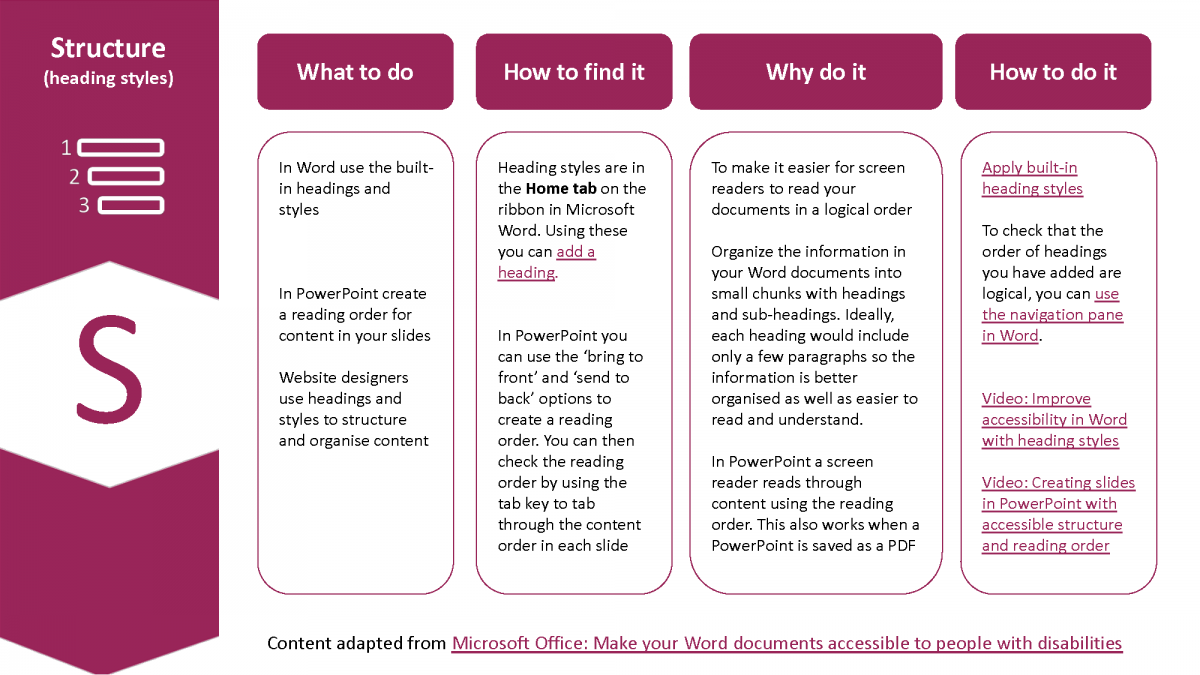
Use heading styles in your document to provide an underlying structure to the document.
What to do
Website designers use headings and styles to structure and organise content. As a rule, properly created web content is more accessible than a document that has been designed to be printed out.
- In Word, use the built-in headings and styles.
- In PowerPoint, create a reading order for content in your slides.
How to find it
Heading styles are in the Home tab on the ribbon in Microsoft Word. Using these, you can add a heading.
In PowerPoint, you can use the ‘Bring to front’ and ‘Send to back’ options to create a reading order. You can then check the reading order by using the tab key to move through the content in each slide.
Why do it
To make it easier for screen readers and other assistive technologies to read your content and documents in a logical order.
Organise the information in your Word documents into small chunks with headings and subheadings. Ideally, each heading would include only a few paragraphs so the information is better organised as well as easier to read and understand.
In PowerPoint, a screen reader reads through content using the reading order. This also works if a PowerPoint presentation is saved as a PDF.
How to do it
To check the order of headings you have added are logical, you can use the Navigation pane in Word.
Videos
The following links will take you to videos on the Microsoft Office support site:
- Improve accessibility in Word with heading styles
- Creating slides in PowerPoint with accessible structure and reading order
Content in this section has been adapted from Microsoft Office: Make your Word documents accessible to people with disabilities.
Colour and contrast
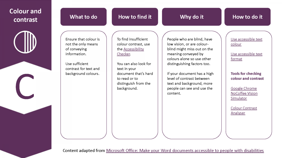
The colours you use and the contrast between text and background.
What to do
Ensure that colour is not the only means of conveying information.
Use sufficient contrast for text and background colours.
How to find it
To find insufficient colour contrast, use the Accessibility Checker. You can also look for text in your document that is hard to read or to distinguish from the background.
Why do it
People who are blind, have low vision, or are colour-blind might miss out on the meaning conveyed by colours alone so use other distinguishing factors too.
If your document has a high level of contrast between text and background, more people can see and use the content.
How to do it
Tools for checking colour and contrast
Content in this section has been adapted from Microsoft Office: Make your Word documents accessible to people with disabilities.
Use of images
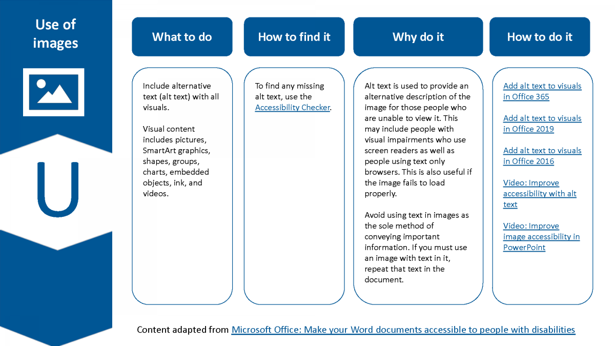
Use alternative (alt) text on your images.
What to do
Include alternative text (alt text) with all visuals.
Visual content includes pictures, SmartArt graphics, shapes, groups, charts, embedded objects, ink, and videos.
How to find it
To find any missing alt text, use the accessibility checker.
Why do it
Alt text is used to provide an alternative description of the image for those people who are unable to view it. This may include people with visual impairments who use screen readers as well as people using text only browsers. This is also useful if the image fails to load properly.
Avoid using text in images as the sole method of conveying important information. If you must use an image with text in it, repeat that text in the document.
How to do it
- Add alt text to visuals in Office 365
- Add alt text to visuals in Office 2019
- Add alt text to visuals in Office 2016
- Video: Improve accessibility with alt text
- Video: Improve image accessibility in PowerPoint
Content in this section has been adapted from Microsoft Office: Make your Word documents accessible to people with disabilities.
Links (hyperlinks)
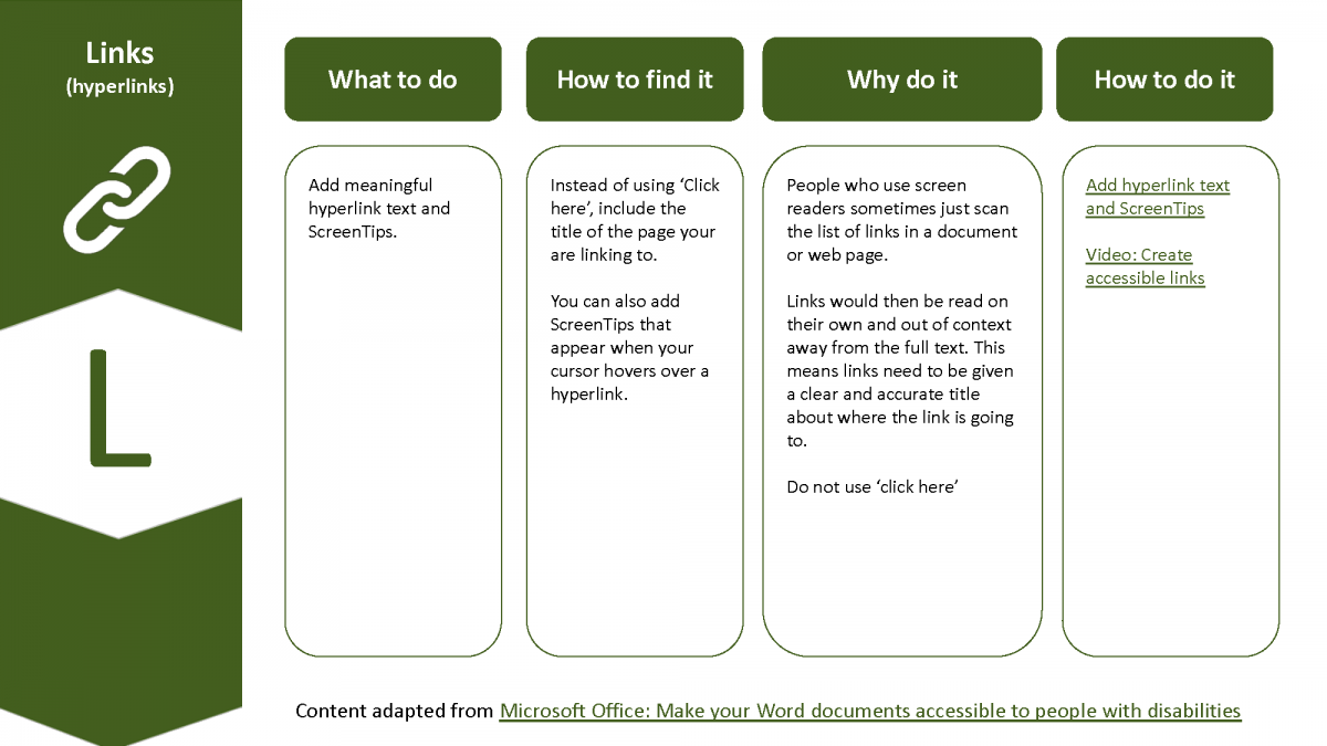
Describe your link, never use ‘click here’.
What to do
Add meaningful hyperlink text and ScreenTips.
How to find it
Instead of using ‘click here’, include the title of the page you are linking to. You can also add ScreenTips that appear when your cursor hovers over a hyperlink.
Why do it
People who use screen readers sometimes just scan the list of links in a document or web page.
Links would then be read on their own and out of context away from the full text. This means links need to be given a clear and accurate title about where the link is going to.
Do not use ‘click here’.
How to do it
Content in this section has been adapted from Microsoft Office: Make your Word documents accessible to people with disabilities.
Plain English
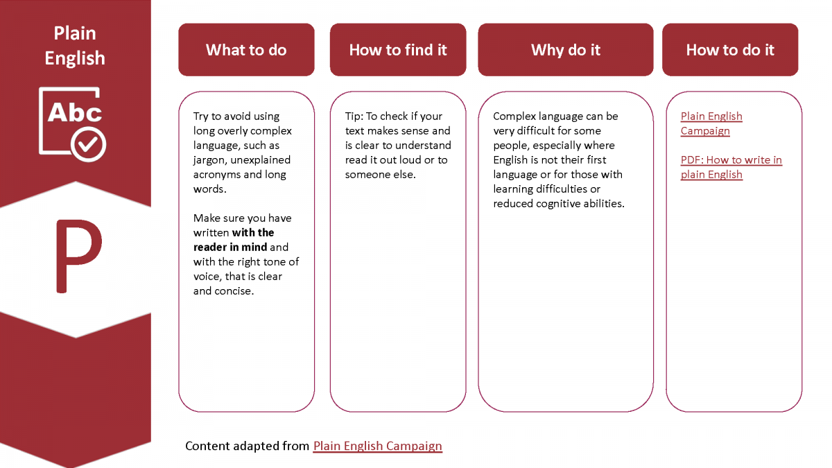
Use clear, uncomplicated language with no jargon.
What to do
Try to avoid using long overly complex language, such as jargon, unexplained acronyms and long words.
Make sure you have written with the reader in mind and with the right tone of voice, that is clear and concise.
How to find it
Tip: To check if your text makes sense and is clear to understand read it out loud or to someone else.
Why do it
Complex language can be very difficult for some people, especially where English is not their first language or for those with learning difficulties or reduced cognitive abilities.
How to do it
- Read the How to write content section of this site.
Content in this section has been adapted from the Plain English Campaign.
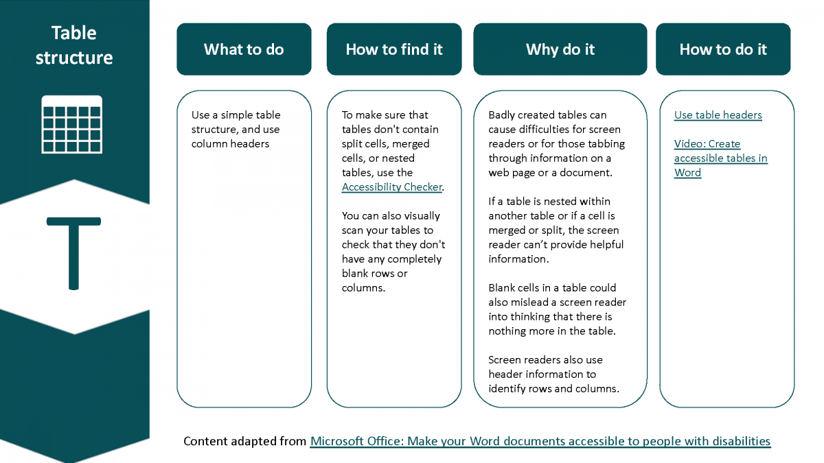
Table structure
Use simple tables without merged or split cells.
What to do
Use a simple table structure, and use column headers.
How to find it
To make sure that tables don’t contain split cells, merged cells, or nested tables, use the accessibility checker.
You can also visually scan your tables to check that they don’t have any completely blank rows or columns.
Why do it
Badly created tables can cause difficulties for screen readers or for those tabbing through information on a web page or a document.
If a table is nested within another table or if a cell is merged or split, the screen reader can’t provide helpful information.
Blank cells in a table could also mislead a screen reader into thinking that there is nothing more in the table.
Screen readers also use header information to identify rows and columns.
How to do it
Content in this section has been adapted from Microsoft Office: Make your Word documents accessible to people with disabilities
